|
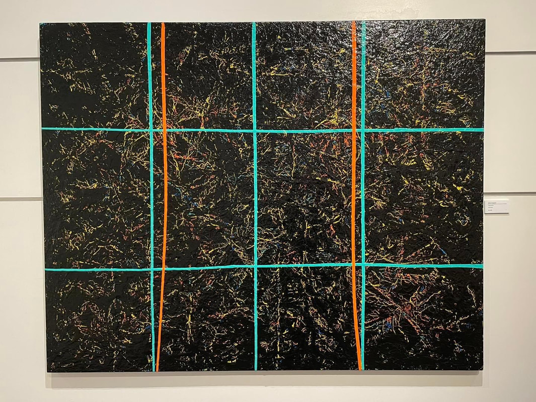
A response to Crossing the line by Arlin Sukarlin at the McKee Gallery, Suter Art Gallery, Nelson Written by Luke Heal 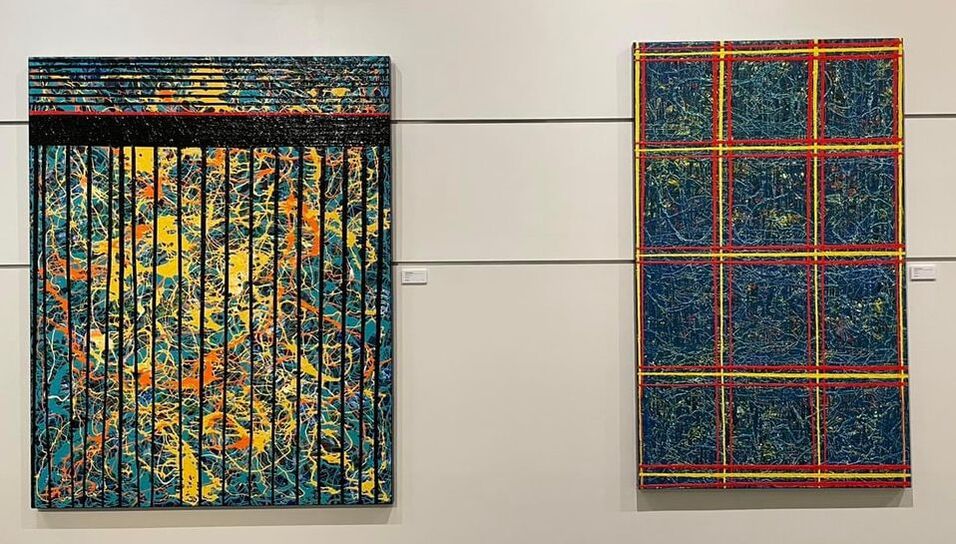 It must take care to be this messy. Great gloops of single paint hues in strings, layered, patterned in hoops and pulsed lines. Methodically, black on white - so the black cracks on drying and the white layer peeps through. A misstep (or miss-gloop) would require a serious cleanup. Any smearing would mean swirling tints and mixed shades. This is not painting with strokes, but with deliberate pouring. The fundamental elements of the whole are single drizzles, like syrupy atoms or squishy pixels. But with each careful application, randomness appears as the paint tangles and curls. Randomness to the eye allows the mind to interpret. Abstraction often means ambivalent stimuli, for which the mind is usually ready to give an interpretation and supply a name. A flat line becomes the horizon, a patch of blue behind criss-crossing black tar spiderwebs, the sky. Mightily coloured dribbles on heroically proportioned canvases face off head and tail in the gallery, pushing for a response. But is it symphonious, or cacophonous? So we stare, trying to determine the meaning behind the globules. Like life, they are best understood from a distance - if at all. Is there a meaning? And if not, does it matter? It might be simply a vicarious sense that it must be fun throwing all that lovely bright paint around - like a kid let loose with the golden syrup on pancake day. If there is no specific literal meaning, it seems better somehow for the painting to have energy and movement. A drab abstract painting might seem a little pointless. Then again, less ebullient emotions can carry weight. Experiences that do not necessarily correlate to words: sub-thoughts. You are now entering the realm of abstract expression. Not a subtle form, this particular breed of full colour-catalogue dribble dash, to be sure. To those attuned, who like a good thick skin of spasmodic pigments on hulking canvases, it is no doubt shouting a mighty tune. Unusually though, for abstract art, each composition in this exhibition has a name. A very literal name. The Windows series have the unmistakable grid of window panes. There are neat lines, masked to a sharp edge, overlaying the paint gushes - grids even. Like bars, clamping down the crazy. Reading between the lines has lines, with things in between. This painting is a little different from the others thoughThis painting is a little different from the others though. There is a relief effect where thick ridges of paint have been rubbed clean, leaving pigment in the intaglio valleys. There is more feel at the detail level. Sharp-edged blobs of opposite colour give way to painterly gradients. There are the familiar strong lines, but also spiralling organic leaf-blade forms. As the only organic shapes in the exhibition, the eye is drawn to them, as the eye is drawn to lowercase words on an all-uppercase page. Equally, the big gallery window framing lush leaves and paddling ducks is sweet relief from the fever dream.
0 Comments
Nelson Jewellery Week April 13-23, 2023 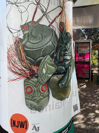 Kirsten Cooper reviewed Monday 16 April 2023, Nelson The phrase ‘an embarrassment of riches’ recurs frequently in my mind as I contemplate the first few hectic days of Nelson Jewellery Week 2023. Exhibitions, artist talks, public talks, debate, film, games, performance, and other activations are taking place in (and on) art galleries, jewellers, clothing and shops, restaurants, bars, historic places, and even a record store, located within easy strolling distance around Nelson’s CBD. Every moment is an opportunity to be inspired or amused, to wonder at, and to be moved by the objects and images created by makers and curated by NJW 2023 Co-Project Managers Katie Pascoe and Kay Van Dyk. The biennial event began in 2021 in response to an exhibition marking 10 years of Wellington-based Handshake Project held at Refinery ArtSpace and has rapidly accumulated momentum. The Arts Council Nelson initiative is one of a small number of international contemporary jewellery events, such as Melbourne’s Radiant Pavillion, and the Jewellery Weeks of Brussels, Munich, Florence, and Romania. This April, contemporary jewellers have gathered in Nelson from around New Zealand and Australia (and further afield) to display, discuss, and disseminate objects and ideas through the channel of contemporary jewellery. And even as that repetitive refrain lurches around my ganglia, I consider the appropriateness of the phrase. Not so much its meaning (as certainly there are more options than possible for a person to select from or attend) as the incorporation of the word ‘riches’ within that phrase and the Pavlovian link of ‘riches’ with ‘jewellery’. Because what is abundantly clear is that many makers working in contemporary jewellery are incorporating materials that are not historically considered ‘precious’. A postered street bollard from Handshake Cohort, Dialogue Collective, ContempTemp Collective (also exhibiting as HSDCTC-COLAB at Refinery ArtSpace) declares contemporary jewellery is ‘intelligent’, providing avenues for questioning. Further, materials used in making can be precious or found, free or gifted. It can be constructed from unusual materials. It can be wearable – but not necessarily so. It has no prescribed dimension. It could be an idea. In short, what can only be said with any certainty is that it has ‘jewelleryness’. As if to reinforce that observation, Moments of Jewelleryness: Off the Hook at Salt Gallery, presented works from an ongoing project by Wellington-based contemporary jewellers Fran Carter and Christine Thomas, that explored the beauty to be found in the mundanity of the urban and the organic. Minumental (The Gallery at Nelson City Framers until April 21) shows works by a group of eight jewellers from around the country, tracking, mapping and documenting gestures honouring the everyday with used tissues, fallen petals and soil. Occupation: Artist, in residence at Refinery ArtSpace until 6 May, also pay homage to the humble and the ‘ordinary’ in their show, Reflect. There is a broad palette of material employed by exhibiting artists. Lisa Furno and Eva Kerer employ discarded plastics and decorative ‘knick-knacks’ to create objects of re-purpose. A collection of creatives is asked to go ‘beyond the template’ to reconsider the traditional signet ring. Licky, is a joyful expression of queer connections via an ice cream date and can be seen at The Quiet Dog Gallery. Across Wakatu Square, disrupted, and reconfigured domestic items are beautifully reconstructed at Parker Gallery. There are chunky, glossy ceramic rings at Kiln Gallery, and elegant works based on the construction of a magpie’s nest at Craig Potton Gallery. At Jens Hansen, Organica showcases the work of six jewellers highlighting the diversity of earth’s ecosystems. In Shine’s window, Isaac Ibbotson combines gold and driftwood. And at NMIT’s G Block, artists explore the social and human condition, and memory of place. 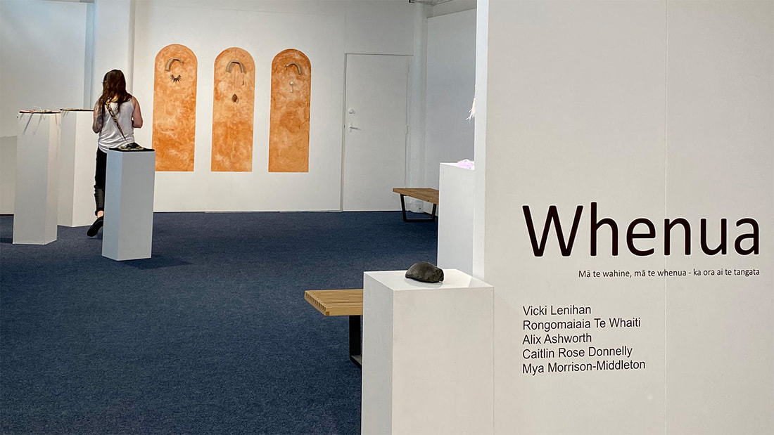 Powerful connection to place is explored in Whenua (Refinery ArtSpace until 6 May) by Ngāi Tahu object-based artists; Vicki Lenihan, Alix Ashworth, Caitlin Rose Donnelly, Rongomaiaia TeWhaiti, and Mya Morrison-Middleton. Respect for Papatūānuku, processes of practice and material are writ large on the walls. And while these objects are created for adornment, they are also for play, and for healing. Observations on the continuum of time are delivered, and stories of belonging, motherhood, family, trauma, and loss are embraced and released through the making. While it is acknowledged that it is not possible to tell other people’s stories, art allows the opportunity to connect with stories that are not your own. Nelson Jewellery Week (gloriously and thankfully lasting for 11 days) is not just an opportunity to celebrate undoubted creative talent but to facilitate exchanges of ideas, process, knowledge, practice, innovation and – whether through linking, knotting, or soldering – to make connections. NJW is funded by Creative New Zealand, Nelson Regional Development Agency, and Nelson City Council. Partners: Refinery ArtSpace, Te Pūkenga Nelson Marlborough Institute of Technology, Objectspace, the Suter Art Gallery te Aratoi o Whakatū, and Uniquely Nelson. www.nelsonjewelleryweek.nz Instagram: nelsonjewelleryweek Facebook: NelsonJewelleryWeek2023 Images courtesy Kirsten Cooper
Street bollard Whenua 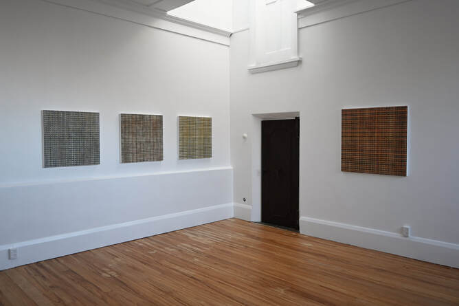 Simon Hunter - Elemental 14 Jan-18 Feb - Atelier Gallery 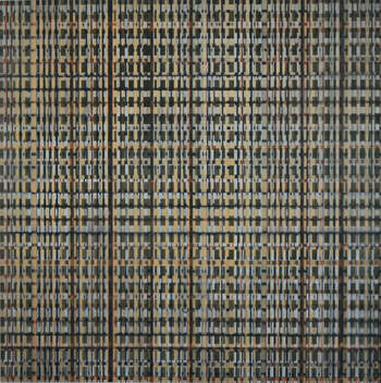 Response by Linda Dimitrievski Walking up the stairs to Atelier Gallery’s new premises, the busy sounds of town fade away, leaving room to think. In the aftermath of a hectic summer season it seems a luxury, a refuge from a frantic time. Nestled at the top of Trafalgar Street, the new space contains two showrooms, with the main room inundated with daylight that comes tumbling down through the skylight and enhancing the quiet ambience. The second, smaller space invites you take your time with its softer illumination and wooden details. Occupying both these spaces is Simon Hunter’s latest body of work, ‘Elemental’. In the main gallery the paintings hang quietly, asking you to stop for a while. Self contained and complete they are nevertheless softly conversing with both spectator and their co-works. At 600x600 mm ‘Know thyself’ is one of the smaller paintings but this is the one that initially draws me in. The interplay of warm and cold colours, sharp and blurred lines resonates with something in me, speaking, perhaps, to a deep-seated need for rest. It opens me to the other paintings, starts the conversation in a soft and thoughtful way. The gentle palette breathes calm while the intricate layering opens up questions both physical and metaphysical. Another work that seem to communicate directly with my unconscious is Phosphorous. Its deeper tones conjure up feelings of security, being centred. Where the other works may be a bit detached, sensibly cooler without becoming imposing or inaccessible, Phosphorous is an inviting display of emotional maturity and warmth. Here, in the shift between logic and emotion, I get a glimpse of the artist himself, the many facets of being human which he explores. In the smaller gallery ‘Salt’, ‘Sulphur’ and ‘Mercury’ fills up the space. At 1440x1440 mm they are large works, demanding the viewers attention. A chair is thoughtfully provided in the corner, bidding you to sit down, to take a moment. Where the previous works are questing, these are statements. They stand confidently and strong. And they are beautiful. The canvases vibrate, move, the eye taken on a journey of the in-between. Still, they are at rest, quietly murmuring in their individual realisation. They make me think of dignified philosophers sharing a moment of quietude, one possibly puffing away on a pipe, while stating their observations with soft voices to each other. Hunters layering of paint and use of differing techniques has created work that seem to quiver, each canvas fluctuating between states of being. They move from organic patterning to binary code, only to take off on a cultural journey before returning, slightly altered, to the natural. The eyes slip at times, soon to get caught in the net again. A space beneath, a line across. Sssh, listen. Soft, earthy tones weave through the paintings, exuding calm. The mind is drawn to comparisons with flax weaving and a more natural way of being - working with, not against, nature. In the next instant computer coding and design emerge from the underlying stratum, drawing on parallels of the natural and the unnatural, human constructs and biological evolution. For all their quiet contemplation they have a lot to say. 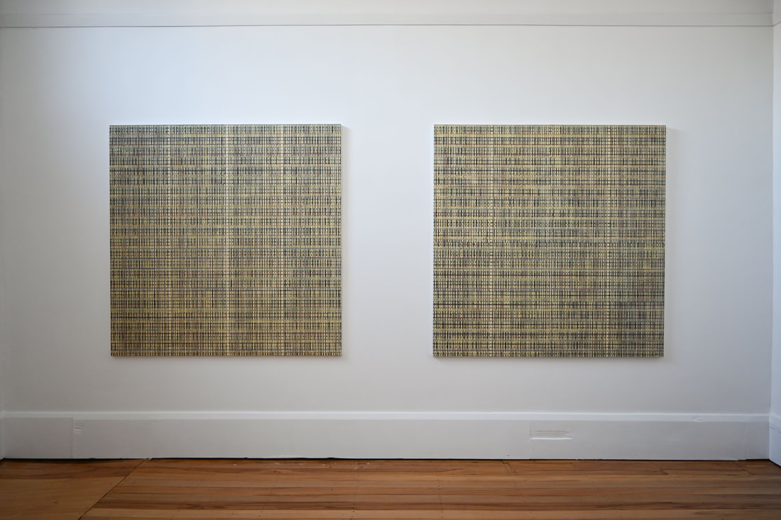 I leave the gallery feeling unexpectedly revived and centred. These are not simple works, they require thought and emotional availability for the viewer to visually listen, to extract what lies underneath the surface. In their silence they ask some large questions, expecting you to take your time answering them. I am reminded of late night conversations, when small-talk and the mundane has run its course and we are left reflecting on the fundamental questions of life in the company of close friends. Maybe it’s not so strange I feel revitalised after all. Image reference
Top - Materia Prima, Gold, Phosphorous In text - Know thyself Bottom - Sulphur, Mercury Images supplied by Atelier gallery Simon Hunter artist (@simonhunter.artist) • Instagram photos and videos 16/1/23-11/02/2023 - Refinery ArtSpace 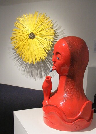 Response by Linda Dimitrievski I did not expect the playful, creative joy that hit me as I popped in to the Refinery Art Space this particular summer’s day. In part escaping the stifling heat outside, the conditioned air inside did little to cool down the riotous assault of colour, shapes and fun that met me by the entrance. Flow - Jamie Brown & Sophie Holt In the little gallery Sophie Holts quirky yet poignant ceramics plays excellently with Jamie Browns sculptural creations. The Motueka based artists collaboration, “Flow”, is an exchange of the whimsical, the works bouncing off each other in a cacophony of colour and form. That is not to say they are competing for prominence, quite the opposite. Like good friends, the brightness of each work is enhanced by the presence of its counterparts. There is a flow between them that leads the spectator on a merry-go-round of new discoveries. The works are unapologetic and bold, the details captivating. It’s a celebration of creative fun and friendship and sets the tone for the following exhibits. 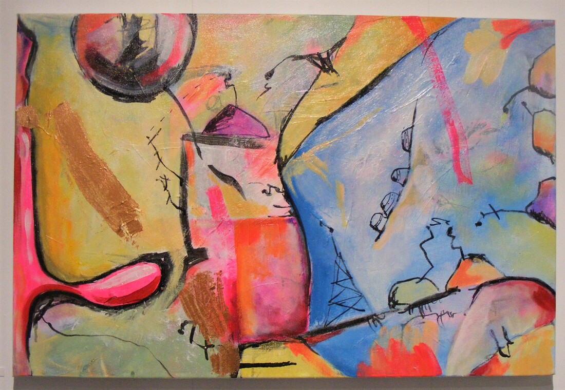 Do you copy? - Sigi Kennedy In the main gallery the walls are awash with paintings telling the story of the Roblobs, Sigi Kennedys imaginary beings, trying to reconnect after the sundering. The quest is complicated as they are harried by space pirates on top of having to search inter-dimensionally for each other. The comparison to our human need for connection is easy to make, what stands out is the transference of the compassion felt for the characters to include oneself and other fellow humans. Mixing the abstract with the cartoonish, I for one excitedly followed them around the room in search for a happy ending. Doused in reds and pink, anchored with bright, earthy tones, the paintings are sparsely inhabited by the Roblobs. The canvases leads you around the space, each both alone and part of the bigger picture. I am hesitant to use the word bittersweet, as the joy I felt seeing these works was so great, but upon reflection there is enough longing and loneliness to justify its use. It is a space opera in pink with dashing heroes (if you’re a Roblob), high adventure and a worthy cause. What’s not to love?  My fantasy amusement park - Jenny Zhong Ascending the ramp up to the top gallery, still buzzing from the previous adventure, I am met by a curious form, a cut out contraption of colour and intrigue. A quick read of Jenny Zhongs statement gives me permission to spin it and next minute I’m in the Auckland artists fantasy playground with numerous wall-hung forms revolving every which way. Being able to activate the work in such a physical way draws me in, allows me to take part in Jenny’s world, and it is fun. The balance of each work creates its own rhythm, doof-DOOF, doof-DOOF, that harmonize or clash with the rhythm of its counterparts. The gyration of the works calls for bodily movement and it’s impossible to be still as the room spins all around. The only thing missing is the carousel music. These are all strong exhibitions in their own right, holding their own conversations, and they would shine anywhere. Shown jointly like this, the result is right down spectacular. Colour, motifs and shared play with the absurd have these exhibitions explode off the walls and floors in what I can only describe as one of the most fun art experiences I’ve had for quite some time. Taken together we are invited to look at life from a different perspective, to shift from focusing too much on the hardships and begin to explore the joy that is to be found. Each artist does this with zest and skill, without faltering and the curation of these exhibits is, literally, fantastic. Don’t miss this one. Refinery ArtSpace
114 Hardy Street Photo credit Linda Dimitrievski 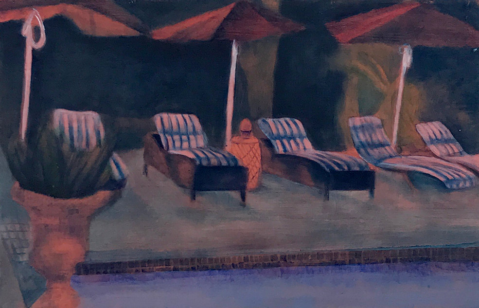 Kirsten Fitzwell - Almost 15th Oct- end of January 18a Gallery Response by Luke Heal  There’s a place on North Indian Canyon Drive, Palm Springs, California called the Movie Colony Hotel. It’s a place of “vintage Hollywood glamour…a fashionable oasis in the Sonoran Desert… a study in modernism and minimalist architecture… a celebration of vintage style and forward-thinking hospitality”. I know this because, backing on to the Warehouse, behind Mag and Turbo, over the way from Spike’s Mechanical Nelson, you can find the 18a Gallery and inside is Kirsten Fitzwell’s first solo exhibition Almost, which includes a painting of the Movie Hotel. The gallery is a small white room behind oxidised aluminium shop doors at the top of a concrete ramp. Fourteen small oil and acrylic paintings currently hang there, each one a recreation of an online marketing photo selling a holiday dream. Paintings of pristine swimming pools attended to by regiments of crisply upholstered deckchairs, whitewashed stucco walls, palms, banana trees and groomed lawns. One presents rows of curtains hanging in a decorative roofless pagoda, the folds of each one paired down in an identical knot, lifted slightly here and there by air unfelt by human skin. When seeing all the works at once in the gallery, it registers that there is no one in any of the pictures. Seeing one work alone, the impression might be a literal intent by the artist to represent a nice villa or hotel. But seen together in the gallery, arranged with considered misalignment, a sense of unease creeps in. Fitzwell’s swimming pools recall the paintings of David Hockney - both are cast in inertial sunlight as if in resin. But Hockney’s pools are punctuated by splashes, and sometimes inhabited by swimmers or onlookers - there is life and movement. It is difficult to imagine anyone swimming in the finely observed, cut-glass pools of Almost. Difficult even to imagine a human being could exist in this crystalized holiday dimension. The pools are well dosed with chlorine before every tourist season. The eye yearns for a forgotten glass, a ball or toy, a magazine or book, a bird or insect. There are no children running across these lawns, no people snoozing in the deckchairs, the laughter of sun-stung holiday makers does not drift through the tipsy evenings here. The works have hot pink reverse sides that cause a diffuse reflection on the white gallery wall, cleverly framing each work with a slight aura. Rosy tones predominate, like the blush of future memories, a nostalgic longing for experiences we have not had - yet. The gentle brush strokes are so different from the emitted light of a pixel screen, the squinty shoulder-knotting experience of a cell phone. The treatment is imperfect, human. One work is almost impressionistic in its approximation. Another has the scratchy sepia feel of an old photo or lithograph. These mansions and hotels are beautiful, the grounds immaculate. It reminds me of a time when friends rented a villa in Tuscany and came back with tales of eating pine nuts straight from the garden. I didn’t really identify with that particular dream, but I was jealous. I wanted to be there in that special place, if only for a few days. It would create a hefty memory and a worthwhile anecdote that would punctuate the timeline of life (“I went to Tuscany and stayed in this beautiful old villa, they had real pine nut trees, it was amaaazing”). Never mind the stress of travel, soon forgotten. Booking.com, Airbnb, Tripadvisor, Expedia, Trivago and others clamour on the screen, should we enter a key word or two that lets on our predilection. Holiday experiences are so commodified that the same night in the same bed can be sold at slightly different margins by dozens of automated systems. I tried doing a reverse image search using an image of one of the paintings. The results were striking: a collage of every configuration of modernist white box, liquid blue trapezoid, all with the terracotta/stucco glow, fluffy clouds - and regiments of deck chairs, always the deck chairs. Such online possibilities raise tickling questions about the artistic process. If the viewer can go online and see the source material, is that problematic? Perhaps an exhibition that responds to something could even include what that something is - in this case, the source images, or links to them. I wonder how landscape painters feel now that viewers can access every scene they paint from satellite, street view, or an almost infinite mosaic of selfies. Wharariki beach in Golden bay is photographed nearly every day, and has ended up as the lock screen for computers all around the world, yet people still paint it. Going online, you could see the 388 images of the Movie Colony Hotel. You could see for yourself how the gently painted works of Almost differ to their online source material. You could decide if the artist is making a subtle protest that asks questions of the global trade in holiday dreams, or commenting on how we tell ourselves that we can be fulfilled by fleeting visits to desirable residences in exotic locations. Hell, you could even book a holiday at the Hollywood Colony - it’s surprisingly reasonable and has great reviews. I wouldn’t turn down a weekend there if I had the choice. Besides that pool I could be happy, living my best life. Almost. 18a Project Space
18a Vanguard St Nelson Open Fri 11-4 Sat 11-2 or By appointment Kirsten Fitzwell (Fitzsimons) (@kirstenfitzwell) • Instagram photos and videos https://www.facebook.com/kirsten.fitzsimons Photo courtesy 18a Project Space https://www.instagram.com/18a_vanguard/?hl=en https://www.facebook.com/18aVanguard
Response by Andrew Robertson 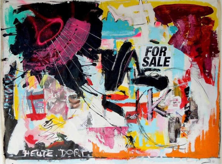 There are few things that I love more than descending enthused and willfully uninformed upon an exhibition that I know nothing about. It was in just such a state of mind that I found myself visiting the Quiet Dog Gallery, caffeinated and care-free, on an uncrowded lunch-break – however, my usual excitable curiosity was somewhat complicated this time when a friend reached out with the rather novel suggestion of writing a review of my experience afterwards. The following account is my rather unpracticed attempt at documenting my entirely subjective experience, with the hope perhaps that you, the unwitting reader may feel compelled to visit the Quiet Dog Gallery yourself for an experience uniquely and expressly your own. ‘Slap!’, I knew, was the exhibition’s title, and Ann Braunsteiner - Nelson’s resident creative dynamo - the artist. Of all else, I was willfully and premeditatedly ignorant, in order to preserve one of my favourite experiences; ‘The Cold Read’. This is a style of looking at art wherein I savour my unfolding reactions and interpretations of the chosen body of work, filtered solely though my own preconceptions, rather than pre-informed opinion. And so I invite you, the unknown reader to join me, reveling in my re-lived ignorance as I step once more through the thresh-hold... Slap! Colour! Movement! Texture! Eyes darting to and fro, each hanging rectangle exuding playful exuberance; a near-tangible tangle of line and text, luridly layered splatters of bold, hyper-active colour. This is … a lot of stimulation to take in all at once. “Slow down, Andy, focus on one thing at a time – and most, most definitely, that third coffee was one too many. And breathe...” Slap! This is no sedate collection of sleepy, sea-side vistas intended to lull the viewer into comfortable somnolence. No, these are far more akin to a synesthesiast’s ecstatic attack upon torpid ease and sleepy complacency. To call Braunsteiner’s works simply ‘paintings’ is to rob them of the sheer frenetic sense of movement; of dynamic, layered complexity barely held in check by the bounds of two-dimensional canvas. Rather than seascape, these feel like a tempestuous riot caught mid-surge - and whilst the target of this intensity may momentarily elude us, the object of ire escaping off-frame, uncaught, the mystery urges us to investigate, whilst the energy and the passion remain, calling us to as-yet-unnamed action. We’re mere seconds inside the gallery now, and this is already an unexpectedly intriguing experience, my attention jolted and seized at a distance, my feet pulled forward to explore further. So let us step closer and see if we can’t resolve some of this restless, barely-contained vigor... Slap! Directly opposite the front entrance, the words ‘For Sale’ are both the first thing to leap out at me from the canvas, as well as, appropriately, the title of the work. A cacophonous collage with long-time collaborator Lee Woodman, the whole piece heaves with a layered glut of symbol, text and decontextualized anatomy, slathered and scraped with hyperactive hues poised seemingly equidistantly between the processes of addition and removal. What we’re left with is not so much a sense of something finished, as a glimpse of primordial process, a window into a pocket dimension where all is, and can only ever be in flux. Separating signal from noise, searching for a coherent meaning and narrative, my mind simply slides off the sides of this dimensional window, like a spider finding no purchase in a wet bathtub. Far from finding this frustrating, this instead feels like the promise of future unfolding, of a richness of context and imagery to be absorbed and digested at leisure, rather than understood and moved on from like some schoolroom pop-quiz. My primary (and indeed, still enduring) sense of this is work pure Passion and Expression - whatever obscure subject or object moved the creators of this piece, move them it most certainly did. There’s a visceral sense of motion arrested mid-splatter, of a drive undiminished in the freezing of timeframes. Still reaching for a frame of reference for this piece, I’m minded of one of the founding fathers of Abstract Expressionism, Robert Rauschenberg (for what is this piece, if not fiercely and expressively abstract?) whose own assemblages of paint, collage and found material so upturned the staid traditions of the American yesteryear. Braunsteiner and Woodman’s collage feels like a 21st century channeling of Rauschenberg’s suggestive thrust, filtered and amplified through the intervening decades of discontent and hyper-capitalized urban decay. Fifty years after the original Abstract Expressionist made his mark, his works remain mostly opaque to my understanding, but not in their primal, insensate reaching – so too, I feel that these works will continue to give of themselves, revealing of and reveling in their layered, provocative complexities for years yet to come. Slap! Pulling out of these complexly abstracted realms, we find ourselves once again grounded in the comforting, industrial reality of the Quiet Dog gallery space. Upon the walls we find further arrangements and explorations, from the cascading colours of Lachen’s geometries, to Wat willst Du?’s swooping, spray-painted lines and cryptic exhortations in Braunsteiner’s native Austrian tongue (my ignorance a little less willfull this time). Ranging in scale, colour, balance and complexity, these further works feel united in the sense of looking through, and in doing so, catching a glimpse of some cosmic-grafitto frozen mid-convulsion. I feel an eerie sense of viewing two equally substantive realities co-existing in superposition, both within the other – inner space and outer space meeting, opposites without opposition. Slap! ...and breathe. I step outdoors, momentarily disoriented as I fumble for my phone to record my thoughts for future reference - ramblings that are still largely unintelligible one week later. Putting all of this into words may be a lot harder than I had originally expected. But please, don’t let my words convince you of the merits of this particular experience – as with most worthwhile things in this life, seeing really is believing. Image reference
L top - Wat willst Du? R top - Lachan In text - For Sale Ann CT Braunsteiner (@annctbraunsteiner) • Instagram photos and videos Ann Braunsteiner (quietdoggallery.co.nz)
Emma Marie - Spaciousness July 16 – August 13 2022 ATELIER Studio|Gallery Kirsten Cooper Saturday 16 July 2022, Nelson ATELIER Studio|Gallery is one of Nelson’s cultural jewels, sitting back from the road at the eastern side of Piki Mai (also known as Church Hill), the site of Nelson’s Cathedral. It is currently hosting the exhibition ‘Spaciousness’ by local artist and NMIT alumnus, Emma Marie. It feels like a particularly appropriate time for the gallery to be presenting an exhibition of this nature, with the first images from the James Webb Space Telescope now being widely circulated, revealing unprecedented views of galaxies beyond our own. And like the first image shown from this historic expedition, Webb’s First Deep Field*; the works in this current exhibition present compositions of colours and marks for our own contemplation of space and our position in that. Unlike the Webb Telescope, however, the artist is not compiling images from physical reality but from the emotional realm. In her statement, Emma Marie explains that intuitive prompts have driven the formation of these paintings, without preconceived ideas of concept. And yet, there is a strong concept of space – both external and internal - underpinning these works, and not just in the exhibition title. Space is there in the relationships between objects and abstract markings. It is there in the graphic and figurative renderings of objects that occupy intergalactic space – planets, nebulae, comets, spaceships – and in our own atmosphere, paper planes. And it is there in the loops, parallel lines, and other markings that create intimations of three-dimensional movement within the spatial boundaries of the frame. Mark-making is an immediately apparent a feature of these compositions. Looped lines repeated in different iterations bring to mind fragments of Cy Twombly’s non-figurative scribblings in his well-documented explorations of history and time. Other marks and layering of colour are reminiscent of the ‘Ten Largest’ - vibrantly colourful works by the spiritualist and pioneering abstract artist, Hilma af Klint. They were recently seen as part of the Hilma af Klint: The Secret Paintings exhibition in New Zealand at Wellington’s City Gallery. Af Klint wrote in her notebooks about having a ‘spirit guide’ in the production of this series, just as Emma Marie writes of the intuitive prompts that underpin the current approach to her practice. There are a wide variety of marks to be seen, made with graphite and pastel or crayon, or by scraping and scoring through wet paint, and in the process, revealing lines of colour from the layers below. There are also mathematical formulae, fine ruled lines, groups of parallel or misaligned strokes falling like rain, or a long exposure photograph, tumbling across the surface. Other marks are drawn within the boundaries of small, repeated circles. Emma Marie has a deft touch with colour, as might be expected from someone with a background in textile and graphic design. This palette is grounded in deep charcoal and white combining to make a variety of greys. They sit alongside earthen umber, ochre and sienna, enlivened by large swathes of pink, with turquoise, teal, red, orange and a startling citrus yellow. There is use of overlapping clouds of harmonic colour that occupy the middle and back ground, and iterative blocks appearing in many of the works that present to this viewer as a kind of sampling. At times they lie along the edge of a piece, as might be seen on a printer’s proof sheet, at other times applied in a group of thumbprint-sized blobs, as though the artist is letting us into the considerations behind her palette choices. Colour is applied as highly textured impasto, wiped off and built up, or applied in translucent layers. Colour blocks are arranged in loose rectangles with relatively contained boundaries, in others, more fluid applications of colour are allowed to run their gravitational course. Gravity, orbit and flight appear to be an area of exploration for the artist. This is particularly evident in the figurative objects occupying their abstract realms. The arrow-like paper planes, are an ongoing motif for Marie and works such as Plane of Existence 3.8, are rendered in crisp detail, with flight trajectories suggested through ebullient, organic loops. These recall memories of simple toy-making, and depending on the quality of construction, folded paper constructions gliding through the air in unrepeatable trajectories of flight. These shapes are also being used as an omnipresent iconography throughout social channels to indicate delivery, direction, and location – giving this viewer further impetus to thoughts of the spatial and our occupation of or in a given place. The planets and other celestial elements appear as objects within these compositions that seem to describe both the order and the chaos to be found in our sphere of existence, in what was, until quite recently in human history, only imagined. Two works, Expansion 3.6 and Expansion 3.9, present images of nebulae that verge on the floral in appearance, with a rich, deep crimson palette employed against brighter, loosely applied areas of colour. As you are directed to the centre, details of the clouds of nascent stars become almost photo-realistic. As Bridget Riley observed in The Eye’s Mind: Collected Writings, 1965-1999, ‘Modern painting is about building a way of looking – it has less to do with what exactly you are seeing than with how you are made to look at it**. Emma Marie has presented a series of harmonious works that reward close, extended attention, and invite fresh consideration of ourselves not only as occupiers of space, but as being occupied by space. Emma Marie, Spaciousness July 16 – August 13 2022 ATELIER Studio|Gallery 329 Trafalgar Square, Nelson https://atelier.org.nz/https://www.emglint.com/ * https://www.smithsonianmag.com/science-nature/nasa-releases-first-breathtaking-images-taken-by-james-webb-space-telescope-180980403/ ** Bridget Riley. “Painting Now”, in Bridget Riley: The Eye's Mind: Collected Writings, 1965-1999. Edited by Robert Kudielka. (London: Thames & Hudson, 1999). 204. |
Our writersKirsten Cooper Archives
January 2023
Categories |
 RSS Feed
Photo used under Creative Commons from jordan parks
